Showing posts with label hockey. Show all posts

6.25.2011

Winnipeg Jets

The NHL's Atlanta Thrashers were recently sold to a group who intend to move the hockey club to Winnipeg, Manitoba. This will mark the return of NHL hockey to Winnipeg, which had a team in the World Hockey Association (WHA) from 1972-79, and that franchise, along with Edmonton, Quebec and New England (Hartford), joined the NHL when the WHA folded. The franchise moved to Phoenix in 1996 to become the Coyotes.

It has been announced that the new Winnipeg team will be called the Jets, as was the previous squad. No announcement has been made that I know of pertaining to the logo and colors, but this gives us a chance to look at the old ones. As always, I copied these logos from Chris Creamer's site.

1972-1974: Classic old school look. Hadn't succumbed to the 70's yet.


1979-1990: Definite 1970's update, but not a bad one. No harm, no foul. I do like the treatment on the word 'Jets'.


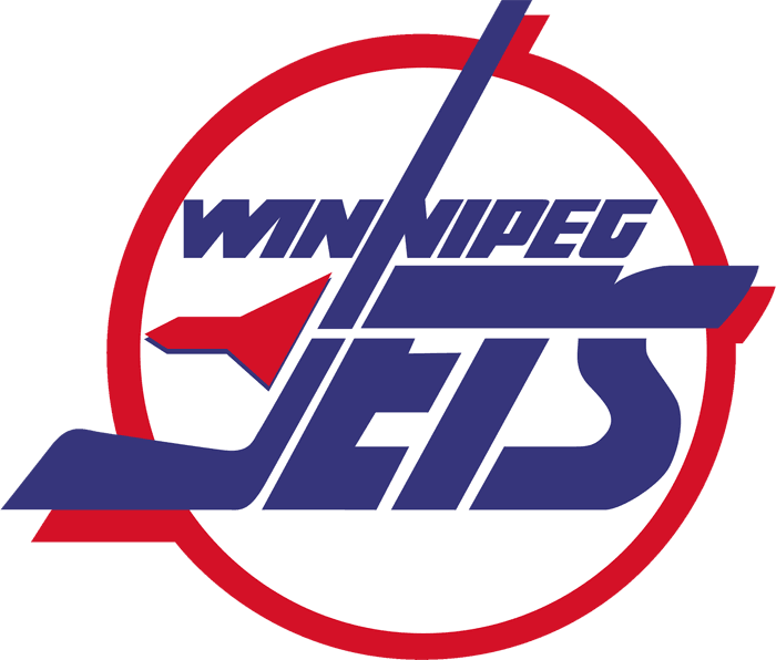
1990-1996: Another relatively harmless update. I do not care for the 'Jets' mark in this as much as above. I am not fond of the 'J' laying over the top of the 'N' above it. But what that does is separate out the 'WIN', which is a nice touch. I also like the drop shadows in red on the 'J' and the top of the 'S'. These nice touches are actually better than the effect of the logo in its entirety, I think.
9.21.2010

Cool Image Of The Moment


The Manitoba Moose of the American Hockey League.

8.16.2010

The Whale

This post is not about Dale 'The Whale', a villain in the recently concluded 'Monk' TV series.

No, this post is about the Hartford Whalers who concluded their run in the NHL back in 1997. It seems all their merchandise still sells well (and why not, it's SHARP!), but now there is interest in reviving the franchise according to this story.

I don't know how that would get done, but I assume it would mean moving a team. I don't sense an appetite for more expansion in hockey. In fact, the NHL probably over-expanded to the south and west 10-20 years ago and now some of those teams might be ripe to migrate to more ice hockey friendly climes, such as Hartford, Connecticut, for example.

In any event, it's a good excuse to run the Whalers logo again.


7.18.2010

Cool Image of the Moment

The Charlotte Checkers play in the American Hockey League and are affiliated with the NHL's Carolina Panthers.

Typically the Checkers colors are red and black, like the parent organization. This version is called 'Go Green' and I can only guess it has some environmental application.

Whatever it is for, it looks great!

And that is the point.